
Why Quilts Matter
Question & Answer with Penny Gold, Part 2
Editor’s Note: The following is Part 2 of guest blogger Bill Volckening’s recent interview with Penny Gold. Click here to read part one.
After your first original quilt, “Loss”, what came next?
I have made a sequence of quilts dealing with my feelings of grief, loss, and guilt, about ten altogether. The quilts that function in my life as art are those formed not from someone else’s pattern, and not for the main pleasure of manipulating the materials, but those that come from a personal need—an idea or emotion that is preoccupying me, that is disturbing me.
Many artists work in response to the natural, physical world, others work from the inside out. I am not responding to the material world outside of me, but bringing out into material the world inside me. Although each quilt is different in intent, they are bound together by the originating motive of response to Jeremy’s death.
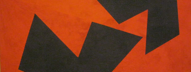
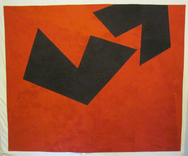
Penny Gold – Shelter
Did you find the work more emotionally draining, or was it cathartic?
The extent to which this work is deeply self-centered is unsettling to me, and a case can certainly be made that art should not be done as a kind of therapy to work out one’s own problems—rather, the purpose of art should extend outwards, to affect others. But for me, the art has been therapy. It has enabled me to stumble, to creep, back into life, to see further into the future than just the next hour. It has provided me a way to live with grief.
If others are also moved by what I have created, that is good. If the work helps someone understand the rupture and persistence of loss, and what is below the surface—determining factors in a person’s life—that is good, too. I learned this as I worked on the “Loss” quilt. Making the quilt was a private endeavor. It’s not something that will ever be used on a bed or hung on a wall. It has served as a kind of therapy for me. And it has also become art—something with the potential of communicating to others, even if that was not my original intention. When I was at the design workshop, well along in working on the quilt design, I brought the small maquette over to Bill to ask him a straightforward technical question. Oddly, he didn’t respond. When I asked again, he said, “Penny, it’s not so easy for me to look at this. I have my own losses too.” It hadn’t occurred to me that something so personal, so specific to me and to David, could also strike this kind of chord with another person.
Had you considered that you were also sending a message with your quilts?
It was not my goal to communicate with others, but my experience and feelings are not unique. Art that embodies my experience can build a bridge to others. In this way, perhaps I fulfill what Roger Sessions sees as the human responsibility of the artist: “above all [the] awareness of the human condition, a common involvement and a common stake in it” (Questions about Music, 166).
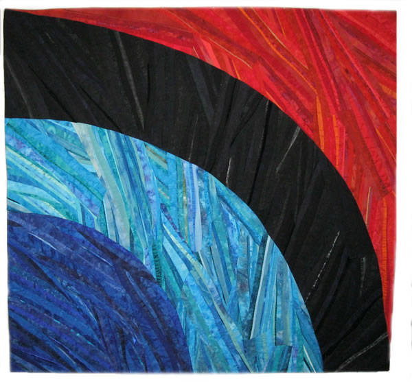
Penny Gold – Regret (front)
Are all of your quilts as emotionally charged?
I have made many more that were entirely different in nature, centered on playing with shape and color, either through using/adapting an existing pattern or working in an improvisational style. One of these quilts was in QuiltCon this year, “Wild Geese,” and it is being published in Sherri Lynn Woods’ new book, The Improv Handbook for Modern Quilters. This type of quilt is engaging to me, and I can happily spend the day piecing hourglass or half-square triangle blocks. I don’t experience them as hard work, in the way that I do the art quilts. I am glad to have both in my life.
What else would you like to share with our readers about your family?
My husband David Amor and I had one child, Jeremy, born in December 1985. Jeremy graduated from high school in June 2004, and would have entered Lincoln College that fall. He died on July 17, 2004, as a result of a car accident.
What can you tell us about “Self Portrait, Year Two (Beneath the Surface)”?
The idea of this quilt goes back to sometime in 2005/06, in the second year after my son died. The expectation of the first year after the death of a loved one it that it will be very difficult; but that after a year, having moved through one marker after another until the anniversary arrives, things would ease up. That was my own experience after the death of both my parents in the winter of 2003. By the summer of 2004, I was feeling I could get back to the normal run of life. But then Jeremy died. A year passed, and the loss continued to dominate my inner life.
How did you begin to move forward with your life at that point?
I carried out daily life, as one has to do. I taught my classes, attended meetings, laughed at jokes, and responded to friends. From the outside, the loss was invisible. But on the inside, I continued to be shaped by loss, grief, and regret. In an early attempt to express this feeling of disjunction between outer appearance and inner condition, I made a small maquette (11 x 14″) that put it in abstract form: a field of black patches in the bottom two-thirds of the rectangle, a lighter field at the top, and the two separated with a narrow band of lavender fabric that represented my external appearance of equanimity.
Only after choosing the color, did I learn from a friend that lavender was the Victorian color of mourning, allowed after black had been worn for a period of time. A few slivers of red were inserted in the black field, representing the stabs of anguish that surfaced without warning. I liked this design, but did not feel a push to take it further into the making of an actual quilt.
What other ideas developed?
I was haunted by the memory of the yellowish mud that covered Jeremy’s body after the accident. I looked for fabric just that color, and after I learned to dye fabric, dyed many samples until I settled upon the hue close to my memory. In parallel, I thought about a statement that would reflect how my identity had changed since the loss of my son. I ended up with “I am a woman whose child is dead.” I searched for ways to inscribe the message in an obscured way, representing its invisibility to others.
How did the idea for a stark black-and-white version develop?
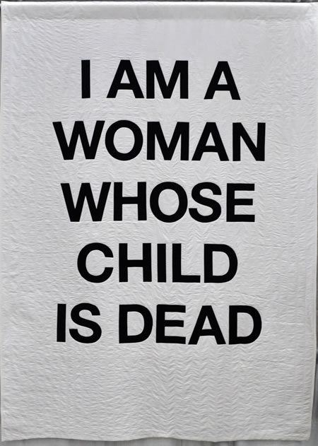
Penny Gold – Self Portrait, Year Two (Beneath the Surface)
For a while I planned to appliqué large letters of the same fabric onto the mud-colored background; I also did trials with just stitching letter patterns in the same color thread. At one point, in 2012, I was talking through the project with Bill Kerr. I meet with Bill from time to time for help with ongoing work.
“I’ve been working on how to make the words only slightly visible,” I said to Bill, “to represent how invisible my state of agitation is to everyone around me. But sometimes I think the quilt should scream out how I feel—that I should proclaim it in bold black and white.”
“Maybe you should make two quilts,” said Bill. These simple words of insight and affirmation were key to the development of the quilt. As Bill and I talked, we developed the idea of making two quilts, with the intent to show them at an exhibition in such a way that the “hidden message” quilt would be seen first, and then afterwards the bold quilt. I eventually changed the color of the first quilt from mud to lavender, pulling in the color from the strip of lavender in the earlier abstract maquette. I dyed several versions of lavender, until I came up with precisely the dusky lavender that I had in my mind. I also moved from the idea of two quilts to one double-sided quilt, which was completed in 2014.
What were your thoughts on how the quilt should be displayed?
In designing the self-portrait quilt, my intention was to have the lavender side be the front, with the quilt hung in such a way that the other side would also be readily visible. If viewed from far away, the lavender side looks empty, but from close up, you can see that a message has been stitched into it; since it’s stitched from the front, the letters are backwards, so further obscured.
When I submitted the quilt to QuiltCon, I designated the black-and-white side as the front, as I thought it unlikely that the lavender image would be juried into the show on its own, though I did ask that the quilt be displayed with both sides visible, if possible
Can you tell us about the construction?
It was a technically challenging quilt to make. Often, a final piece looks simple in design but is the result of many decisions on multiple fronts. Choosing what font to use for the message was one decision. I am very satisfied with my final choice (Helvetica Neue Bold), but it came only after many weeks of trying out various fonts, reading about typography in general, and about Helvetica in particular. The size of font to use was another decision, and then figuring out how to print out letter templates that large. Bill Kerr and Tim Stedman of the Knox College Art Department helped with all things typographical.
How did you decide on the layout?
How to lay out the eight words of the message was another decision. Should it be horizontal like a billboard, which I had in mind when choosing Helvetica; or should it be vertical? I chose vertical because it is closer to the human figure, and I think of this as a self-portrait. I also decided how many lines the message would be, and where the line breaks would fall.
Many versions were printed out in small format on the computer until I came up with the one that felt best to me. I enjoy hand appliqué, and assumed I would use that for fixing the letters to the background, but I decided that crisp edges and corners were more important than the pleasure of handwork, so I fused on the letters instead. I tried out horizontal quilting lines, but decided on vertical, and then tried out various spacing for the vertical lines. I ended up with spacing just a little narrower than the width of the letter elements. I also tried out various battings, ending up with a layer of felt for the batting, as I wanted the quilt to be very flat.
Did it go together easily at that point?
There were many challenges throughout the construction process. Because the quilt is meant to be two-sided, and I didn’t want a rim of binding around the edge, I used a “pillowcase binding,” which is difficult to do on such a large piece. I kept all the layers lined up by laying them all out on the floor, secured with masking tape. I laid out all three layers (top, bottom, batting) on the floor, holding them down with masking tape.
After the sandwich was stitched and turned, I needed to mark the quilting lines. I needed something 8 feet long, rigid and straight. Wooden molding was not straight enough, so I found a heavy strip of metal that worked. I used that to mark the placement of the rows, using a marker to mark increments. Then I used it as a guide for mark the lines, running a Hera Marker along the edge. A final challenge was to keep the white fabric clean throughout the process!
What did you think when you were finished?
I look back through my notes and samples, done over a period of nine years, and marvel at the idea’s permutations. The measure of the quilt’s success for me is looking at it and knowing I would not change anything. The response by viewers at QuiltCon suggests that the meaning of the quilt came through to viewers, further deepening my satisfaction with the quilt—and my gratitude towards the teachers and friends who have made it possible.
In our early correspondence, I said, “It is a memorable, intensely emotional quilt, and from my experience I can predict it will go down in history as one of the iconic quilts of the early 21st century. That’s how good it is. This is why quilts matter!!” When you first read that comment, you were not sure how to respond. Now that you’ve had a little more time, how would you respond to that statement?
Well, I’d love to turn the question back to you and ask you to explain what led you to make this statement! I have been bowled over by the extent of response to the quilt, and the enormously positive nature of that response. I am moved by the number of people who commented that the quilt helped them understand the nature of grief at the loss of a child, and those who, understanding it all too well from their own experience, expressed appreciation for my giving voice/vision to these feelings.
To call the work “iconic” suggests that it represents a larger trend, and will continue, over time, to stand out as a memorable example of that trend. Certainly the use of lettering and words as a central design element is a noticeable element in art of the last fifty years or so. Cy Twombly is a special favorite of mine. Also, letters and words are also used in some contemporary quilting; Sara Impey and Judy Hurwitt are two artists whose work I follow. Not long after I settled on the final design of the quilt, I saw Elizabeth Hartman’s billboard quilt-along, another example of using text on quilts. I can understand that the strong emotion expressed through the simple, stark design of my quilt may make it especially memorable.
More About Penny
Penny Gold received a Ph.D. in History from Stanford University, and taught history at Knox College for 36 years, until her retirement in 2012. She lives in Galesburg, Illinois, with her husband David Amor. Their son, Jeremy Gold Amor, died on July 17, 2004. Penny’s blog may be found at Studio Notes.
Photos are courtesy of Penny Gold.

[…] Year 2: Beneath the Surface.” The interview by William Volckening is available on the web here. (This is part 2; a link to Part 1 is given at the top.) A second shorter interview by Abby […]